Over the last few years, I’ve had the absolute joy (and let’s be honest, the occasional headache) of helping craft hundreds of ads, brochures, billboards, brands, and the occasional off-the-wall sticker. Along the way, I’ve worked with wildly talented creatives, turned mild ideas into hot campaigns, and watched as our media buys crushed industry benchmarks over and over again.
Sure, we’ve won some shiny awards (Addy’s, Telly’s, CASE, NCMPR—thanks, judges!), but the real win? Knowing that our work has helped drive millions of impressions and tens of thousands of students to apply, enroll, and chase big dreams.
In celebration of GradComm turning five, I’m taking a moment to show off a few of my favorite pieces: some bold, some beautiful, some just plain fun. Ads might not be art, but the best ones still feel like something.
For a more comprehensive look at our work, check out our portfolio here and some of our award-winning pieces in this blog, “Winning Big: Marketing Lessons from a Year of Award-Winning Projects.”
Orange County Regional Consortium – General Enrollment Campaign
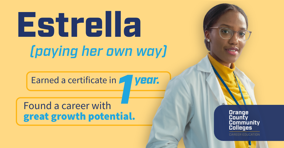 -Design by GradComm Art Director Chris Carroll
We came up with this idea for the Orange County’s Future Built campaign a year or so ago and continue to run with it. I love how the ads tell a full story. I admit they’re a bit copy-heavy but sometimes you gotta indulge the writer (especially if he’s the creative director 😉). Estrella is a fictional persona, but her story is as real as they get which is why this series was so loved by the client and continues to perform so well.
Orange County Regional Consortium – “What is Career Education Video”
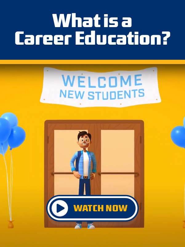
-Animation by Neighbor Animation; story by GradComm Creative Director Michael Mahin
I talk about this video and the awards it won all the time blah blah blah. But there’s a reason I talk about it! Neighbor Animations’ high-end production paired with a clear and compelling story makes this a standout you can’t ignore. By showcasing how career education helps students and regional businesses, this video is unique in that it gets to paint a complete picture of how career education positively impacts a community.
Long Beach Adult Education – Accelerate Tagline & Brand
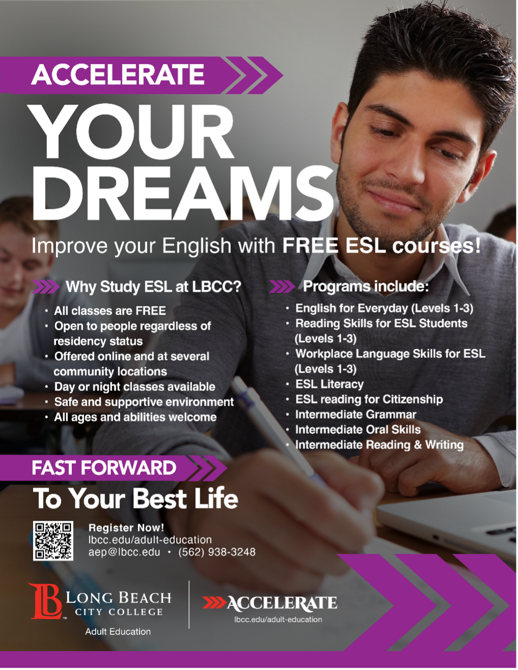 -Design by Chris Decatur
When we first pitched, “Accelerate,” the client was surprised—she was expecting something “softer” and more support focused. After all, that’s the core of adult education. But it wasn’t long before she and her team were fully onboard with the active, energetic, and goal-crushing themes that aligned perfectly with Long Beach’s culture.
Not only do I love the tagline lockup by itself, but I especially love how all of the collateral incorporated its design elements to create a cohesive and compelling branded identity the whole college can be proud of.
Los Angeles Community College District – Promise & General Enrollment Campaigns


These are just fun! Designed by GradComm Art Director Chris Carroll, the subjects are literally jumping out of the images which gives them a youthful, energetic, and personable vibe. I’m a big proponent of images that feature smiling faces. They seem to welcome you in. I was thrilled when our client agreed with this direction.
Foundation for the Los Angeles Community Colleges – Logo
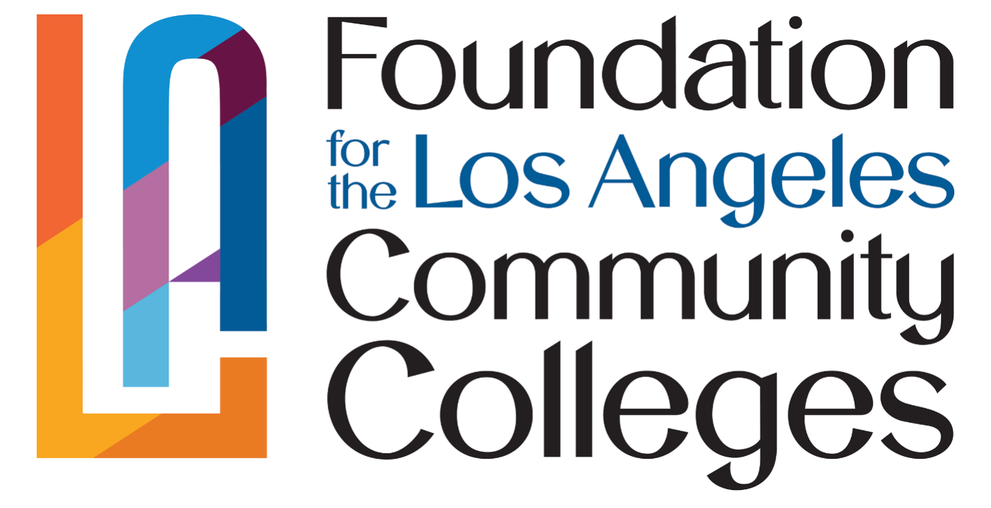 -Design by designers Chris Carroll, Clara Oses, and Harry Decker.
Brand and tagline projects are never easy and this project was no exception. Even though FLACC was over 35 years old, they’d never actually had their own logo or a real brand strategy. Initially, our mock-ups struggled to strike the right chord but that struggle was important because it helped the client come to a deeper understanding of what they wanted and us come to a better understanding of what they needed.
What I love about this project is that it showcases the power of creative collaboration and the importance of being flexible yet persistent even when things get hard. Multiple designers played an important part in this design and I think the result speaks for itself.
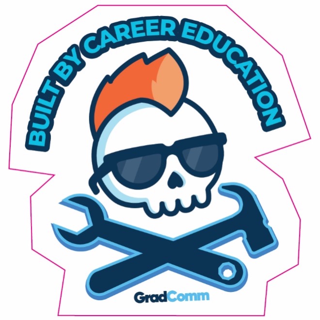
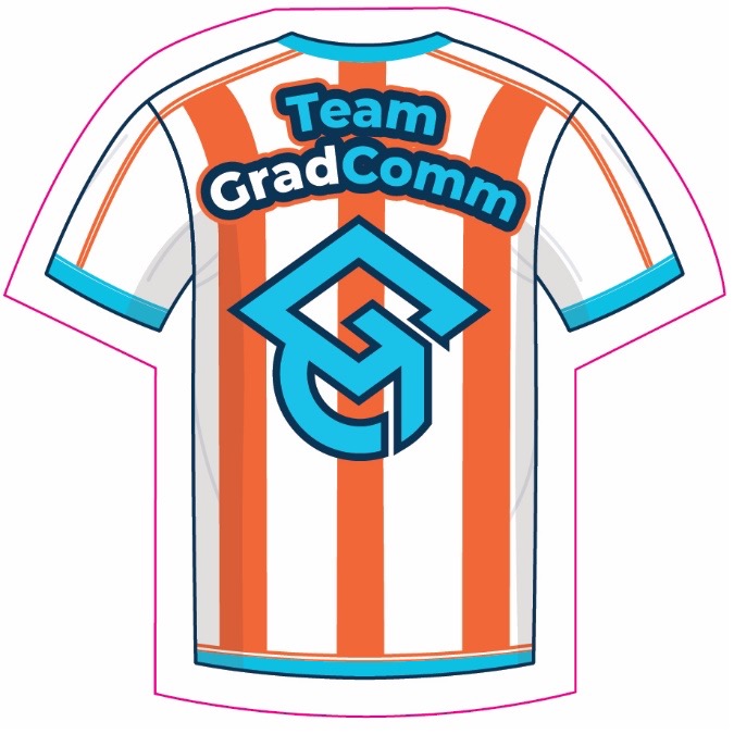
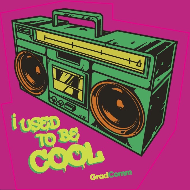
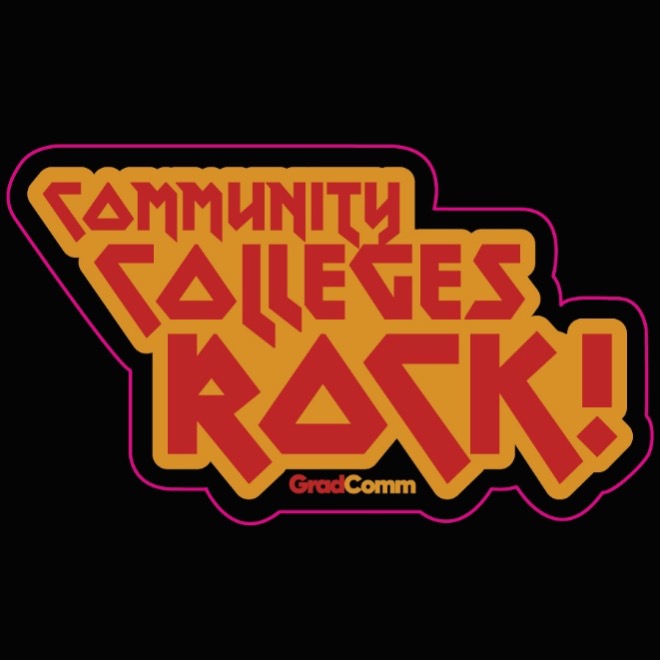
GradComm Materials
My philosophy has always been that as a marketing agency the most important brand we maintain is our own. That’s not because I’m selfish but because taking care of our own brand and designs shows our clients that we can take care of theirs.
Our own stuff also gives us a chance to stretch our creative legs a bit and have a little out-of-the-box fun. I hope you enjoy seeing these pieces as much as we did creating them!
Everything you see here is the work of Art Director Chris Carroll and myself, unless otherwise noted.
GradComm Logo
I love our logo and the brilliant work of designer Chris Decatur! One of the first projects I oversaw. The G/C takes a second to find but once you see it, you love it!
Annual Magazine
Our yearly magazine. Not only is it filled with practical content, but it’s a showcase of great publication design. The fun part? We hold a cover photo competition with our clients every year!
Product Cards

I love the vibrancy of these product cards. Marketing booths can feel like a sea of the same, so these are intentionally super bright so they stand out not only on our conference tables but when placed next to other vendor materials. I also like the humor here. We all know that student!
Conference Ad
IMO conference ads aren’t just about promoting services, they’re about showing (not telling) potential clients that our creative rocks. I love how this piece finds a way to use our brand elements that feels fresh and new. I also like the subtle humor that says we aren’t your normal, stuffy agency.
New Client Welcome Packet
One of my favorite projects of all time—our new client welcome packet. This is the cover to a small booklet introducing new clients to who we are to help them get plugged in and ready to jam. See what I did there? The best part, the whole packet is built around this “let’s rock” idea because when the vibe is right from the start, everything else is just a killer encore. Ok. I didn’t it again, didn’t I?
Stickers